All of Western Bloc’s album Sleeves have been designed and put together by the mysterious ILK Graphika. Good art work is really important, even though it’s now just a tiny square on a hand held device, one can dream of it being on a 12″ sized vinyl sleeve.
These are the stories behind the sleeves by ILK.
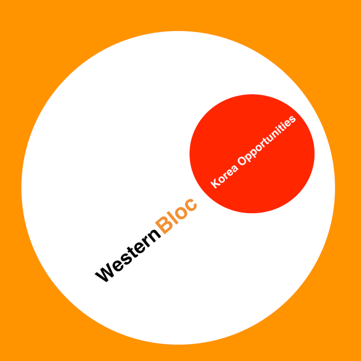
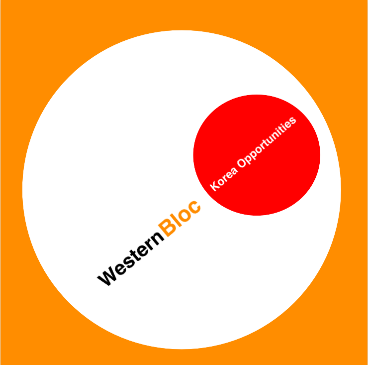
The first sleeve was for the single “Korea Opportunities”, based on a design made for Sainsbury’s (A United Kingdom Grocery supermarket chain) own-brand packet of biscuits (cookies in North America). It’s such a striking beautiful design by Peter Dixon, who did a whole range of Sainsbury’s items from Cat Food to Frozen peas. The image also reminds me of Soviet era propaganda posters, in particular the Beat the Whites with the Red Wedge, biscuits and revolution!

The debut album is also heavily influenced by the work of Peter Dixon, in particular his brilliant use of colour. The white and black lettering with the orange background is very bold, the orange was key to Sainsbury’s branding and seemed suitably refulgent especially with the yellow and black dots, it has a very 70s feel to its assemblage, and the Helvetica font blends beautifully with the retro background.
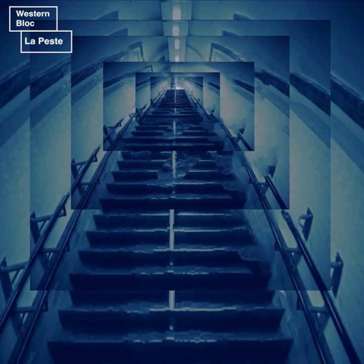
For Le Peste, an old photo of a staircase in the London Underground was used. The same image was manipulated and distorted, and layered upon the previous image and treated with a blue hue to get the effect of the staircase becoming like a tunnel. It was meant as a nightmarish vision, the broken steps, the journey into an unknown.
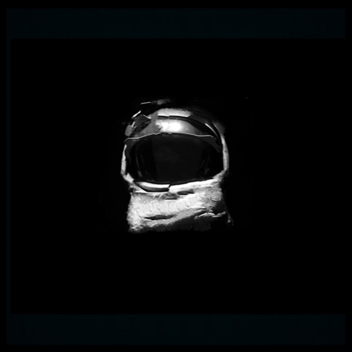
The slightly distorted space helmet in the darkness was chosen for Monkey Christ. The term Monkey Christ was given to the questionable restoration of the Elías García Martínez depiction of the face of Christ, when a parishioner, Cecilia Giménez, tried to restore the fading, flaking painting. The music on this album, in particular the title track, was a little more avant garde and dealt with death. The Monkey Christ here was more influenced by the darker moments of 2001: A Space Odyssey, in this case the disembodied space helmet adrift or perhaps observing from space just like the obelisk in the movie, it is meant to be dark and foreboding, an external force on the event horizon of oblivion. No artist name or title, its stark simple image meant to reflect the darkness of the music.
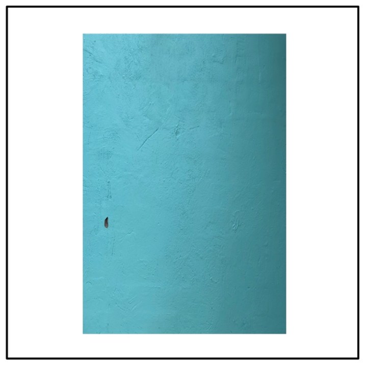
The music on Solitude for the Masses was very different to the last album, it was more “commercial” more of a pop sound, it was in essence brighter. For the sleeve, a photograph of a freshly painted wall with a single blemish, a hole in the concrete, was used and turned on its side, the stark block was influenced by the genius of Mark Rothko, and the white background was intended to represent the wall of a gallery. The “painting” hangs there, and if you look close it has what looks like a textured canvas, the flow of the paint, in this case it does not necessarily say anything about the music, it is simply meant as art, whether it achieved that is anyones guess.
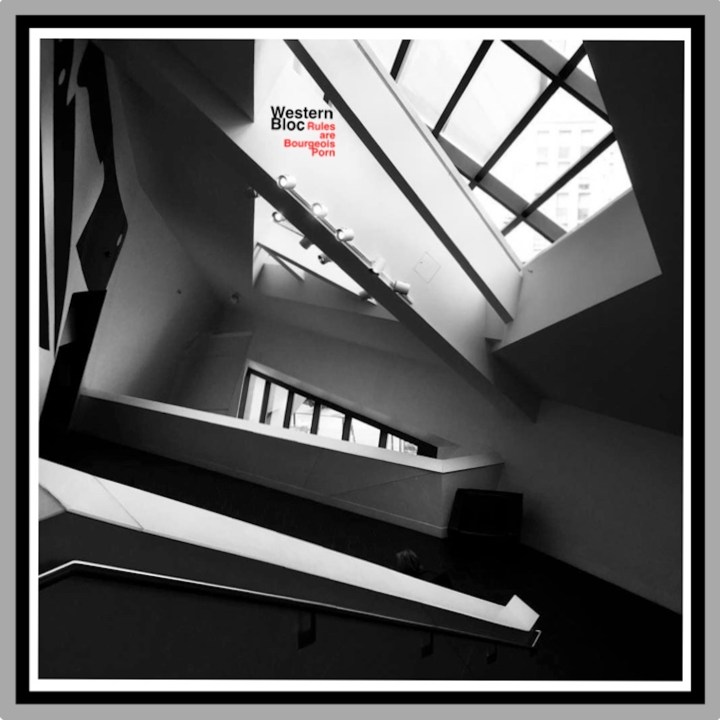
The photograph here was taken in the Denver Art Museum, the angles reminded me of the Vorticists, the work of Wyndham Lewis and Edward Wadsworth, and especially the cover of BLAST magazine done by Lewis. It has the angles, the shadows, and the natural light coming in, the black and red artist name and album title are like a lone exhibit where you would least expect to find it in a museum, after 2 albums without text, this seemed an appropriate time to bring the traditional album credits back. The rear of the album has the track listing printed similar to the Vorticist text from Blast magazine, a method also imitated by The Fall’s masterpiece Hex Induction Hour.
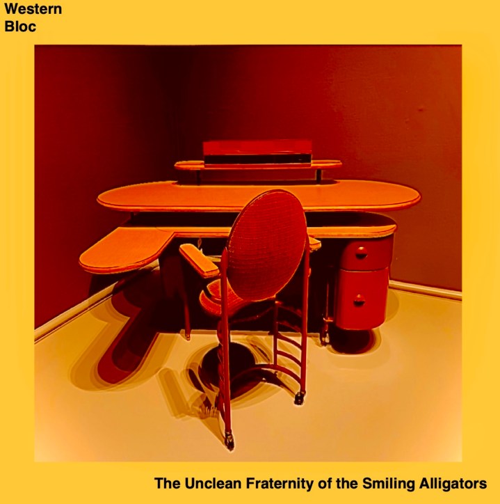
Another museum photograph, this time at the Art Institute of Chicago, the picture is of a design by Frank Lloyd-Wright. McCarthy presented us with the photo, and what the title of the album was going to be. There was a strange juxtaposition with the Desk and the seemingly obscure title, (it was taken from a paragraph in the Jean Genet book The Thief’s Journal) neither the title or the image being connected in any way. The colour was important here, no colours have really repeated themselves with the album covers, the photo was manipulated to give the red/orange hue that seemed to match the beauty of the wooden desk. With the colours sorted out just the placement of band and album name was left.

For Creatures, the album title was there first, using AI we assembled images that had been created with the request of a creature in a field or a bird in an icy landscape, all images where a creature was asked for, but not always specified. Of all the results, this was the favourite for the album cover, the snowy wasteland, the tufts of grass surviving the winter, and then the mysterious, lone creature, the image had an ethereal quality to it.
